library(tidyverse)
library(ggformula)
library(broom)
library(knitr)
library(patchwork) #arrange plots in a gridAE 05: Mathematical Models
Songs on Spotify
Important
Open RStudio and create a subfolder in your AE folder called “AE-05”
Go to the Canvas and locate your
AE 05assignment to get started.Upload the
ae-05.qmdandspotify-popular.csvfiles into the folder you just created. The.qmdand PDF responses are due in Canvas no later than Saturday, September 14 at 11:59pm.
Data
The data set for this assignment is a subset from the Spotify Songs Tidy Tuesday data set. The data were originally obtained from Spotify using the spotifyr R package.
It contains numerous characteristics for each song. You can see the full list of variables and definitions here. This analysis will focus specifically on the following variables:
| variable | class | description |
|---|---|---|
| track_id | character | Song unique ID |
| track_name | character | Song Name |
| track_artist | character | Song Artist |
| track_popularity | double | Song Popularity (0-100) where higher is better |
| energy | double | Energy is a measure from 0.0 to 1.0 and represents a perceptual measure of intensity and activity. Typically, energetic tracks feel fast, loud, and noisy. For example, death metal has high energy, while a Bach prelude scores low on the scale. Perceptual features contributing to this attribute include dynamic range, perceived loudness, timbre, onset rate, and general entropy. |
| valence | double | A measure from 0.0 to 1.0 describing the musical positiveness conveyed by a track. Tracks with high valence sound more positive (e.g. happy, cheerful, euphoric), while tracks with low valence sound more negative (e.g. sad, depressed, angry). |
spotify <- read_csv("data/spotify-popular.csv")Are high energy songs more positive? To answer this question, we’ll analyze data on some of the most popular songs on Spotify, i.e. those with track_popularity >= 80. We’ll use linear regression to fit a model to predict a song’s positiveness (valence) based on its energy level (energy).
Below are plots as part of the exploratory data analysis.
p1 <- gf_histogram(~valence, data = spotify) |>
  gf_labs(title = "Distribution of Valence",
       subtitle = " for Popular songs on Spotify",
       x = "Valence")

p2 <- gf_histogram(~energy, data = spotify) |>
  gf_labs(title = "Distribution of Energy",
       subtitle = "for Popular songs on Spotify",
       x = "Energy")
p1 + p2 # The patchwork package will arrange your plots for you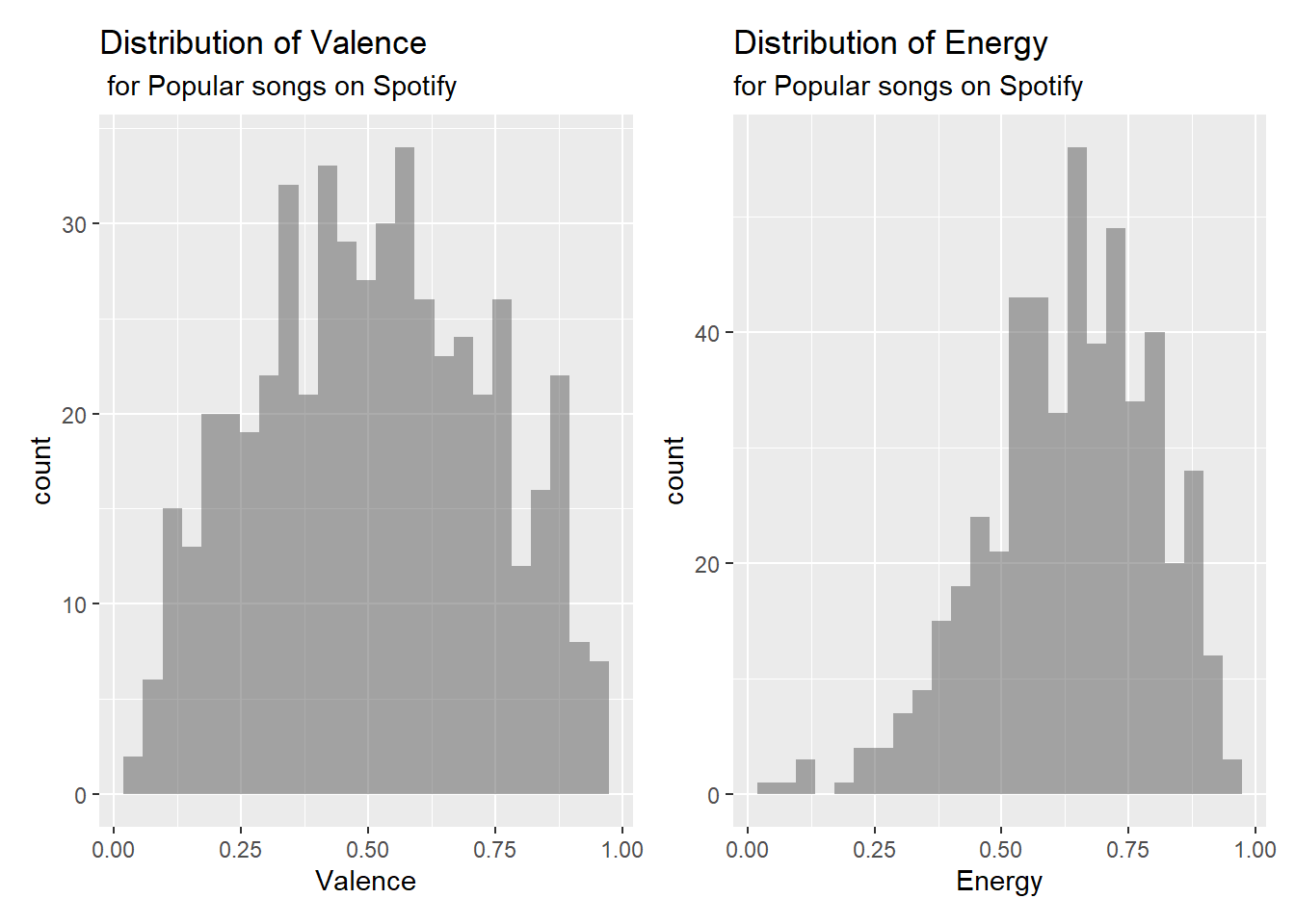
gf_point(valence ~ energy, data = spotify) |>
  gf_labs(title = "Valence vs. Energy",
       subtitle = "Popular songs on Spotify",
       x = "Energy",
       y = "Valence")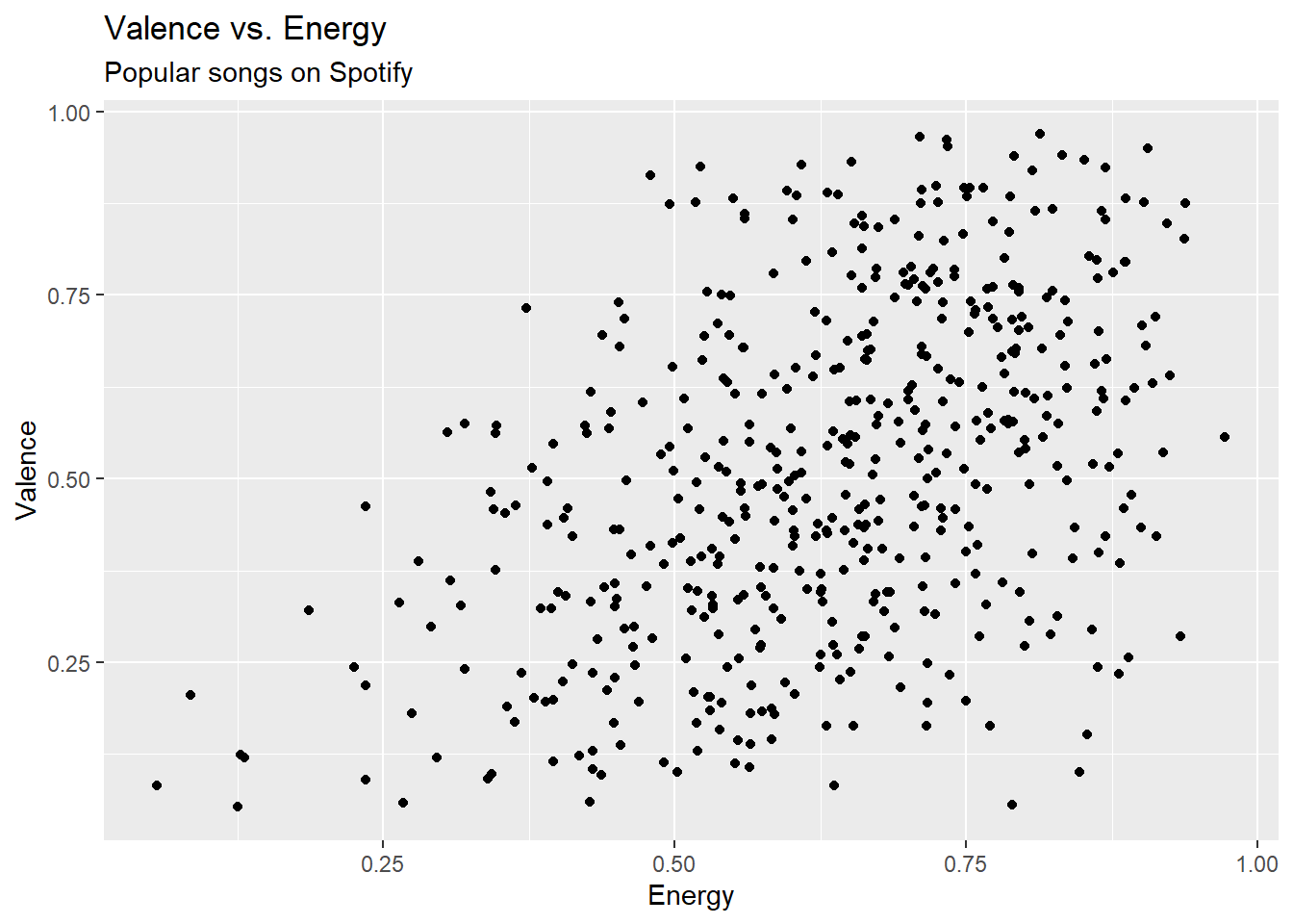
Exercise 1
Fit a model using the energy of a song to predict its valence, i.e. positiveness. Include the 90% confidence interval for the coefficients, and display the output using 3 digits.
## add codeExercise 2
In words interpret the estimate and confidence interval for the slope in the previous exercise.
Exercise 3
Interpret the p-value from Exercise 1.
Exericse 4
Predict what the average valence for a song with an energy score 0.5 is. Report and interpret a 90% confidence interval for the average valence.
Exericse 5
Report and interpret a 90% confidence interval for a single song with energy score 0.8.
Important
To submit the AE:
- Render the document to produce the PDF with all of your work from today’s class.
- Upload your qmd and pdf files to the Canvas assignment.